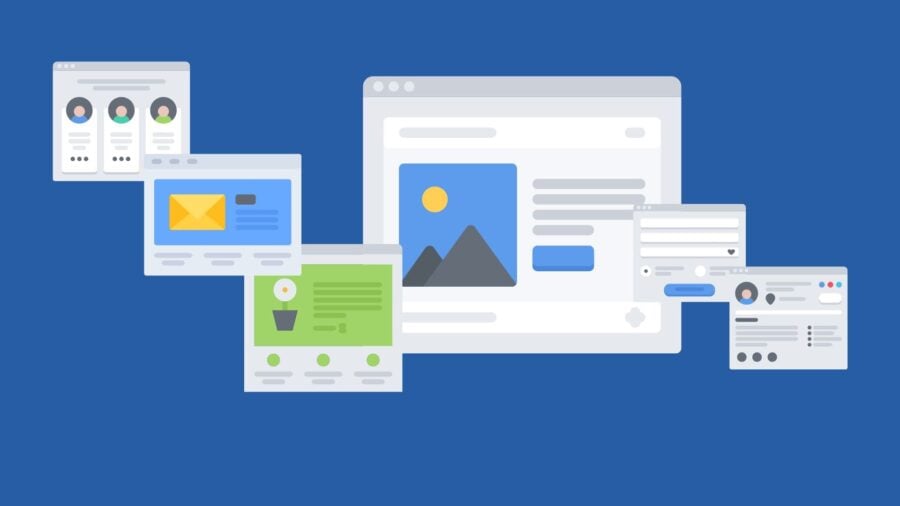
THE CORRECT STRUCTURE OF A LANDING PAGE
-
Post author

-
A landing page is a standalone web page created to generate leads (potential customers) or quick sales. It is also called a target or landing page, a capture page, and a Landing Page. The term “one-page website” is also known but is not entirely accurate, as even a multi-page web resource can have the structure of a landing page with its characteristic blocks.
Consumers arrive at a landing page after interacting with specific marketing material or channel where the ad was placed. The transition can be made via a post with a link on social media, creating an ad in Google Ads or Facebook Ads, a call to action in an email campaign, etc.
The stage of the sales funnel at which the landing page appears depends on the specific marketing strategy. However, in almost all cases, the Landing Page brings in customers or “hot” leads who, after familiarizing themselves with the offer, are ready for consultation or purchase.
Article Content
- What is a landing page and who needs it?
- Advantages of using a Landing Page
- Landing page structure
- Cover with USP and CTA
- Product essence or project description
- Usage stages
- Pricing
- Target audience “pain points”
- Photo gallery or video clip
- Competitive advantages
- Result
- Usage scenarios
- Comparison (life with and without the product or advantages of the product or service over alternatives)
- Facts and figures
- Inspirational quotes
- Testimonials
- Guarantees, anonymity, certificates, awards
- Team
- FAQ
- Photos with celebrities
- Partner and/or client logos
- Collaboration scheme
- Lead magnet, quiz (survey), or calculator
- Contact details
- How to increase the effectiveness of a Landing Page?
- Conclusions
What is a landing page and who needs it?
The first company to create a landing page is considered to be Dropbox. In 2006, it introduced its file storage and sharing service using a Landing Page (LP), which consisted of feature descriptions, videos, and illustrations. The call to action was an invitation to reserve the product’s beta version.
Thus, even before its official launch, Dropbox became popular. The landing page proved to be an effective tool for attracting attention and an essential component of the marketing strategy.
Traditional websites are designed for all categories of users with various goals. A landing page is aptly named a target page, as it differs from online stores, business card websites, and other types of web resources in that it serves a specific purpose.
Landing pages are designed with the needs and problems of a particular target audience in mind. Because of this, the content is relevant to potential customers’ queries, and the calls to action are timely and convincing.
“A landing page eliminates distractions by removing navigation, competing links, and alternative options, thus capturing the visitor’s full attention. And full attention means you can direct the visitor where you want — to your lead form. Hence, landing pages are specifically designed to create conversions.” — “The Ultimate Guide to Landing Pages”, — Christina Perricone
Who can use a landing page?
- Startups and business newcomers. At the early stages of business development, the main goal is to reach as wide an audience as possible and successfully present a product or service. A landing page excels at this task.
- Specialists. Coaches and mentors, private doctors and cosmetologists, tutors and dietitians—the list of fields is endless. If you provide services independently or with a small team, the best way to announce yourself to the world is to create a landing page and launch contextual advertising.
- Service market representatives. Marketing agencies, online schools, cleaning companies, gyms, and dance studios all use web resources with a landing page structure. Any business in the service or education sector can attract customers through landing pages.
- Developers of services, programs, apps, and informational products.
- Some product sellers. A landing page can complement the main site to promote a specific category of goods or a single popular product. By creating a separate one-page website for it and directing traffic to it, you can increase profits, for example, by taking advantage of the demand for gifts during the Christmas season or the presentation of a new product on the domestic market.
To make sure your landing page is seen by potential customers, it’s essential to spread the word among the interested audience. In addition to paid advertising, this can be done by placing a link in the profile description on social media, in themed blog articles, in books, or any electronic lead magnets.
If you have a multi-page website, a good place to add a link to the landing page could be a pop-up or a banner on the homepage.
There can be multiple landing pages, depending on the scope of your offerings. A landing page works best for lead generation, meaning that even if you don’t achieve immediate sales, it will collect data on potential clients and add them to the sales funnel. It’s important to plan ahead where the user will go next. For instance, you can involve a call center or create segmented email groups for targeted campaigns.
Advantages of Using a Landing Page
It is known that the average conversion rate of a landing page exceeds that of an online store by 7–10 times. Additionally, creating one requires a modest budget and significantly less time than developing and launching a multi-page web resource.
Let’s explore the main advantages of using landing pages in marketing.
- Increase in leads. Focusing attention on a single goal increases conversion rates because visitors are not distracted by additional CTAs or secondary elements.
- Improved advertising efficiency. With a landing page, you can accurately measure the effectiveness of ad campaigns. You’ll be able to track how many users visit the page, how many perform the desired actions, and the revenue they generate.
- Audience adaptability. For different audience segments, you can create different landing pages and tailor the ads accordingly. This will positively impact ad budget planning and improve visitor loyalty.
- Increased trust. A well-designed landing page can boost user trust. Brief but informative descriptions appeal to busy consumers who don’t like reading long texts or calling to make a purchase.
- There are many good examples and a wide variety of templates designed for different purposes and niches. This is useful if you’re creating a landing page for the first time. However, ideally, the landing page should be designed from scratch and filled with unique content.
- On a landing page, the scroll is limited to up and down only. This page structure, without links to other sections, increases conversion rates. There are exceptions when either all or certain pages of a multi-section website follow the structure of a landing page.
- It is perfect for creating a WOW effect, promoting new products, seasonal goods, or trendy services.
- A landing page can be used to test the demand for a new offer or announce an event. Often, a website’s main page is designed as a one-page web resource, focusing the visitor’s attention on the most important aspects.
- A landing page is an optimal tool for building and expanding a customer base. First, you increase reach through ads, then bring visitors to the landing page and offer them a lead magnet or a discounted product, after which you “process” the base in various ways (remarketing, email marketing, telemarketing, etc.).
Thus, filling out a lead form on the landing page means the customer has entered your marketing funnel. This is the beginning of a relationship with the customer, and how it develops depends on product quality, an effective strategy, and other factors.
Landing pages have their drawbacks, or rather limitations. They can be entirely ineffective in the case of complex and expensive products. In such cases, consumers take time to decide, seek out maximum information about the company, and CTAs with many lead forms can backfire—reducing trust.
Another aspect that may deter many entrepreneurs and marketers is the high cost of promotion. Landing page advertising requires investment, with constant analysis and improvement of campaigns. Promoting a one-page website using traditional SEO methods is quite challenging. The main source of traffic is paid advertising.
Landing Page Structure
Before creating a landing page, you need to determine which segment of the target audience it’s aimed at and what offer needs to be presented on it. A landing page can achieve various goals.
- Encourage subscription to a newsletter in exchange for free materials or another value (lead magnet).
- Sell a low-priced product (tripwire), such as a book or mini-course.
- Promote a free trial version of a service, first visit, trial lesson, etc.
- Increase sales of a product or service.
- Test demand for a new product, launch a startup.
The purpose of the landing page defines the style of the texts, the specifics of visualization or interactivity, and the presence of additional elements. However, the components of landing pages in various business niches are generally very similar.
“The good news is that you don’t need to be overly creative. Most landing pages have very similar structures because they are proven to work. You can add creativity with branded elements and images, but stick to the landing page format people are used to seeing.” — “The Ultimate Guide to Landing Pages“, — Christina Perricone


Let’s consider the thematic blocks that any landing page may consist of. You’re unlikely to find a landing page built from all these parts. Typically, there are no more than 10. Some of these structural elements are specific to certain industries (e.g., program descriptions for educational courses), while others are universal and essential (like the first block with a headline or a list of the offer’s benefits).
Cover with USP and CTA
On the first screen, it’s important to showcase the most crucial elements — the essence, value, and uniqueness of the offer with a call to action.
📌 Read in the blog: What is Call-to-Action?
Brainstorm with your team or simply ask yourself a few questions to determine how compelling your offer is for the audience.
- Does the product solve the target audience’s problem?
- Is there an obvious benefit that a potential client can gain from this offer?
- Can my offer compete with other alternatives on the market?
📌 Read in the blog: How to Create a USP
Great Sample Resume positions itself as a “resume builder that simplifies life.” On the first screen, there’s an animated visualization of how easy it is to use the service:
- “Creating a job resume doesn’t have to be difficult.
- Print and download
- Create a resume for free
- Send it to employers
- Get the job!”
The steps are explained in more detail below, but within the first few seconds of visiting the site, the potential client already understands the key benefit of the offer.

Product essence or project description
In this section, the site visitor learns about the essence of the offer and gets answers to the questions “What is it?”, “Why?”, “What are the features?”. Visualization is mandatory — this could be an infographic, a cutaway image of the product, or simply a high-quality photo of the product or the service delivery process.
GetResponse demonstrates the functionality and interface of its email marketing platform.

The usage process is shown on Shopify website.

Usage stages
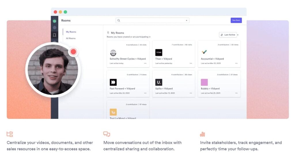
Depending on the product being offered, step-by-step descriptions may include a workflow, an explanation of different parts of the interface, etc. Vidyard describes the service’s capabilities (file storage, movement, user engagement tracking, etc.). The website is dedicated to detailing the stages of use.
Pricing
If it’s about selling a specific product or category of services, you can indicate the price and list what’s included, or provide a price list. For complex products, such as online services, a comparative description of several pricing plans or service packages is the best solution. GetResponse took this approach.

Target Audience “Pain Points”
You can describe the key problems of different audience categories, adding convincing images. Another way is to depict the customers themselves, highlighting their typical traits to trigger associations with the site visitors’ own experiences. The goal of this section is to create a sense of identification with the described personas, leading to the belief that this product will solve their problems and improve their lives.
Photo Gallery or Video Clip
If you have a beautiful office where clients can visit, a training room, or another location, show it to potential customers. A gallery of photos from significant events, activities, production processes, etc., works well. The visualization depends on the business field. For example, a great way for a cosmetic clinic to showcase professionalism is by featuring “before and after” photos.
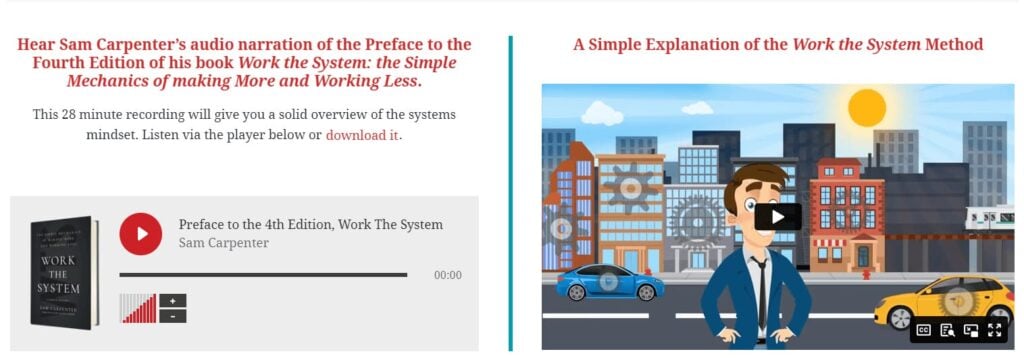
Videos build even more trust and engagement. This could be a video message from the CEO, a striking promo video, or an explainer video briefly demonstrating how the product works. For introducing readers to Sam Carpenter’s book Work The System, the website includes an audio recording of the author’s preface and an animated explainer video.
Competitive Advantages
The Dropbox website explains how its storage service differs from competitors in the market.

Result
A separate section should be dedicated to outlining the benefits that the consumer will receive after using the product or service, such as on the Waterllama, mobile app website, a water consumption tracker.
If a potential customer is already familiar with the interface of the service, they may still question whether they really need it or wonder what positive outcomes could result from drinking water regularly. A separate section lists the health benefits of maintaining optimal hydration.

Usage scenarios
Dropbox’s website shows various ways the service can be utilized.

Comparison (life with and without the product or the product’s benefits compared to alternatives)
On Vidyard website, there are two lists comparing sales with and without the service. This method can be used to compare a product or service with competitors (without specific names) or, as in this case, to highlight the drawbacks of doing business without the proposed solution.

Facts and Figures
The GetResponse platform uses facts and figures to confirm the company’s expertise and advantages.

Inspirational Quotes
One of Vidyard clients says the service allows them to showcase individuality and ensures personal connection. The quote is visually emphasized, focusing attention on the words highlighting the benefit for users: “engaging and converting potential clients.”

Testimonials
The ClickFunnels customer acquisition service landing page has two sections dedicated to testimonials. The first showcases written comments, while the second is even more persuasive, consisting of video testimonials from clients.

Content for a gallery or testimonial section doesn’t need to be professionally created. In many cases, evidence provided by real customers, including their photos, videos, and comments with links to social media profiles, works better. You can install an Instagram widget or another similar feature on the website. Testimonials can also be supplemented or replaced by success stories and case studies.
“You can also use user-generated content (UGC) as social proof. Stackla’s 2021 report showed that 59% of consumers find user reviews to be the most authentic form of content. This figure is even higher among younger users: 67% of millennials and 73% of Gen Z take action after seeing social proof.” — “The anatomy of a landing page: 9 essential elements with examples”, — Jenna Romano
Guarantees, Anonymity, Certificates, Awards
In the banking sector and for money transfer services, confidentiality of information is a top priority. The client needs to be sure that their data will not be shared with third parties and that, in case of card loss, the account can be easily blocked. Revolut considered this when creating its landing page.

Team
For potential clients, it’s important to understand who they will interact with when contacting the company, especially in the service industry. Small companies typically only list key employees, as Sparktoro does.

FAQ
The ClickFunnels customer acquisition service landing page includes a concise FAQ section that addresses common concerns of website visitors. Such informational blocks help resolve objections from potential clients without involving managers or incurring extra phone costs.
📌 Read in the blog: How to Respond to Customer Reviews

Photos with Celebrities
Photos with celebrities enhance a specialist’s credibility and affirm the achievements described on the landing page. Entrepreneur, speaker, and author Марі Форлео uses numerous social proofs of the quality of her informational products on her personal website. Among these are photos with famous TV hosts, business coaches, authors, and more.

Partner and/or client logos
You can display logos of the most well-known companies globally, nationally, or regionally (with their permission). A good example is the list of brands that Dropbox collaborates with.

Collaboration Scheme
If users are initially curious about how the product works, their next question at the decision-making stage will be how to place an order and what comes next. Monobank provides a step-by-step guide on how to get their card.
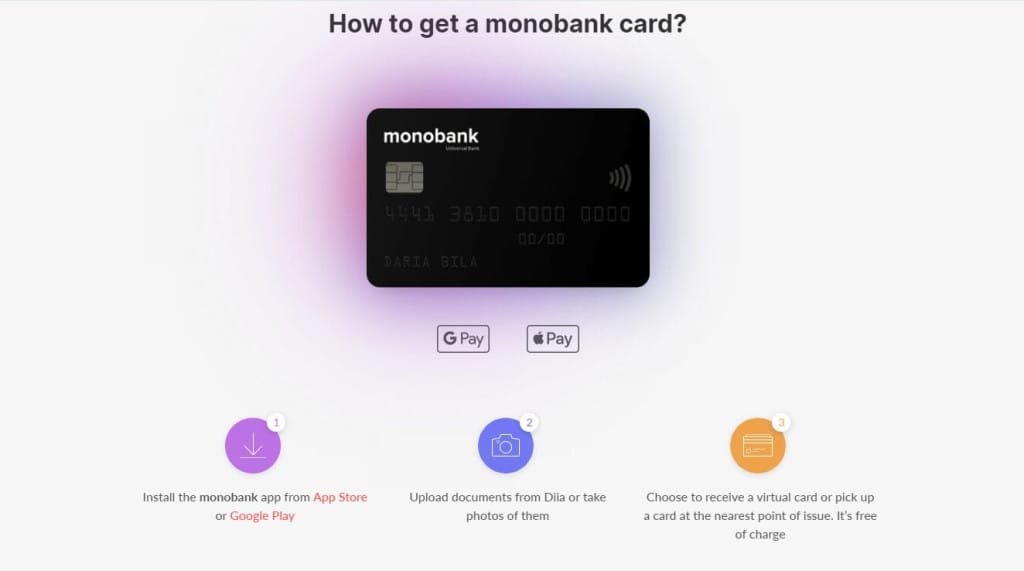
Overall, the mobile bank’s website is quite unique. Its structure and texts are based on common customer questions, turning the landing page into a creative FAQ page.
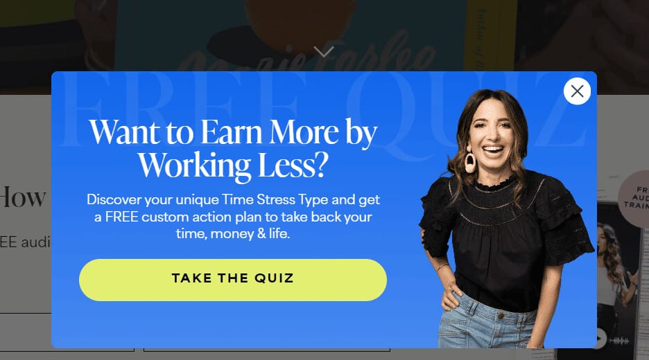
Lead Magnet, Quiz, or Calculator
Additional free offers can be placed in a pop-up or a separate lead form at the bottom of the page. Marie Forleo offers visitors a quiz to help them get a personalized action plan to achieve their goals.
📌 Read in the blog: How to Create the Perfect Lead Magnet on a Landing Page?
Contact Information
It’s advisable to provide website visitors with the option to contact a company representative through any convenient method: leave a lead form, set up a callback button, or share a phone number, email, and physical address. Show your location on a map, as Glovo does.

If a consultation is a key step in starting a collaboration, it makes sense to display not only the executives or key specialists but also the managers.
How to Improve the Effectiveness of a Landing Page?
There are several additional rules and ways to retain customers, increase their trust in the brand, and encourage cooperation.
Caring for the environment, humane treatment of animals and other values that the brand upholds are important indicators for many conscious consumers.
Limit the number of decisions users need to make on the page. On the Great Sample Resume platform, almost every section has the same call to action: “Create your resume.” You can rephrase the CTA or add calls to increase your customer base (for example, signing up for a newsletter or receiving free materials in exchange for an email).

When creating a lead generation form on a landing page, only include mandatory fields. Ideally, this would be just a name and phone number. Additional details can be clarified during a conversation.
Don’t forget an informative footer. In the “footer,” include links to the “Privacy Policy” page, if possible, the “Terms of Use,” the brand’s logo, and a copyright notice.
Avoid overusing advertising blocks and words like “we,” “our,” etc. Instead, add as many case studies and testimonials as possible, along with phrases from clients, company experts, or partners.
“92% of people read online reviews before making a purchase. 88% of them trust peer reviews more than brand messages. WikiJob increased its conversion rate by 34% just by adding testimonials to their landing page. It was the only change they made!” — “7 Steps to a Perfect Landing Page”, — Neil Patel
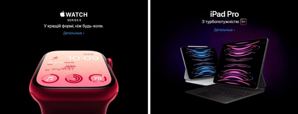
Use only high-quality images on your landing page. Otherwise, all efforts will be in vain. The block design determines the first impression visitors have of the company and whether they’ll even read the text.
Apple attracts users’ attention with bright, contrasting background colors and impressive, large-scale product photos. This approach focuses visitors’ attention on what matters most—the products.
Don’t forget to create a thank-you page. This is where customers land after filling out a lead form. A thank-you page serves three purposes:
- provides the promised offer (in the form of a request submission or file download);
- engages the new potential client with additional relevant content;
- expresses gratitude and increases brand loyalty.
The thank-you page can also invite visitors to the company’s social media or blog.
A landing page is an ideal tool for promotions and sales. Offer to purchase a product before a certain date and receive a discount.
An LP doesn’t need to be long. In some industries, short landing pages have higher conversion rates. This especially applies to advertising webinars and other events, as well as selling a product or service to “warm” clients who are already familiar with the offer.
Before launching the landing page, ensure that the site is responsive across different devices and minimize loading time.
FAQ
A Landing Page is a specially designed page meant to encourage users to take a specific action (convert into placing an order, signing up for a consultation, subscribing, etc.).
The structure of a landing page consists of sequentially placed thematic blocks that gradually reveal the necessary information for the target audience. It can be outlined schematically and filled with text after agreeing on the “skeleton” of the landing page.
The parts of a landing page are also called blocks or screens. These are the elements that the user sees without scrolling down. Each part has a specific goal, such as presenting product features, providing social proof, or collecting contact information.
A landing page should have a cover (the first screen with the USP and CTA), a description of the product’s benefits, the advantages users will gain, social proof (testimonials, guarantees, case studies, team info or founder’s message, etc.), and contact information.
A landing page must include informative and eye-catching headlines, subheadings or descriptors, bullet points with visuals such as icons or photos, CTAs, and lead forms. The structure of the landing page depends on its theme and goals. The headline, call to action, and lead form are key components of a landing page.
Conclusion
The structure of a landing page depends on its goals and the business sector. A landing page may have more than 10 blocks filled with detailed descriptions or just two sections. However, even in the latter case, the landing page always includes elements like a headline with the unique selling proposition, a subheading and/or description, an image or video, a CTA button, and a lead form.
Additional but often crucial elements are trust-building components: case studies, client logos, testimonials, guarantees, and certificates. Frequently, especially for complex products, potential customers need more information to make a decision. For this, a section on the product or service’s features and benefits, as well as details about the team and their achievements, will be necessary. Pricing details and FAQ sections help address common consumer objections.
Creating highly effective landing pages is an art. This work usually requires more creativity and innovation than writing an article or preparing any other marketing materials. Try to limit the customer’s choices and illustrate a clear connection between their problem and your solution. Images must be convincing, and the text should be rich in descriptions of the user’s benefits.
-
Tags